Why, oh why couldn't I have registered for the 3000 class that designed play posters instead of posters about other graphic designers? I understand that we need to know how graphic design has evolved, but isn't there a better way to do so?? >:(
I am not Bradbury Thompson.
Saturday, April 19, 2008
(less than 2 weeks...need to vent)
Posted by Rebecca M at 11:29 AM 1 comments
Monday, April 7, 2008
brrrrrrrrrrrrrrrrrrrrad

Here's the new image I plan on using for my Bradbury Thompson poster... Color wise, I may try it on a solid black poster or maybe keep it white...I'm not sure yet. Just playing around right now.
Posted by Rebecca M at 5:26 PM 2 comments
Sunday, April 6, 2008


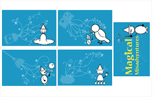
I've redone my postcards based on what everyone said during the final critique. I've tried to incorporate the screen backgrounds more effectively on the fronts, and for the title card, I've tried to make the layout more successful and give your eye a path to follow. What do you think?
Posted by Rebecca M at 2:51 PM 1 comments
Thursday, March 27, 2008
Saturday, March 15, 2008
Initial Icon from 3000
I've decided to rework some of my projects from last semester now that I have a better grasp of the software.
This is the first project from 3000. It's a logo created from my initials, which are R.M.
Criticisms and praise are equally appreciated.![]()
Posted by Rebecca M at 8:02 PM 7 comments
Tuesday, March 4, 2008
Monday, March 3, 2008
Progress

So, here they are. The backgrounds include a spell book, a cauldron, a broom, and a potion bottle. I just realized that I actually forgot I had done the castle tower...so...if one of these is weak, lemme know if you think the castle tower was better. Maybe use the castle for the title card??
I'm not crazy over the broom background...
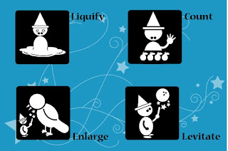
The little guy on the right is the set icon :)
Reverse side will be coming soon... Once again, feedback is GREATLY appreciated, as well as suggestions (especially for the title postcard!)
PS- I realize that the back foot on Enlarge is not filled with white...copy error ^_^
Posted by Rebecca M at 9:25 PM 3 comments

