Why, oh why couldn't I have registered for the 3000 class that designed play posters instead of posters about other graphic designers? I understand that we need to know how graphic design has evolved, but isn't there a better way to do so?? >:(
I am not Bradbury Thompson.
Saturday, April 19, 2008
(less than 2 weeks...need to vent)
Posted by Rebecca M at 11:29 AM 1 comments
Monday, April 7, 2008
brrrrrrrrrrrrrrrrrrrrad

Here's the new image I plan on using for my Bradbury Thompson poster... Color wise, I may try it on a solid black poster or maybe keep it white...I'm not sure yet. Just playing around right now.
Posted by Rebecca M at 5:26 PM 2 comments
Sunday, April 6, 2008


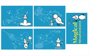
I've redone my postcards based on what everyone said during the final critique. I've tried to incorporate the screen backgrounds more effectively on the fronts, and for the title card, I've tried to make the layout more successful and give your eye a path to follow. What do you think?
Posted by Rebecca M at 2:51 PM 1 comments
Thursday, March 27, 2008
Saturday, March 15, 2008
Initial Icon from 3000
I've decided to rework some of my projects from last semester now that I have a better grasp of the software.
This is the first project from 3000. It's a logo created from my initials, which are R.M.
Criticisms and praise are equally appreciated.![]()
Posted by Rebecca M at 8:02 PM 7 comments
Tuesday, March 4, 2008
Monday, March 3, 2008
Progress

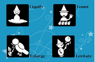
So, here they are. The backgrounds include a spell book, a cauldron, a broom, and a potion bottle. I just realized that I actually forgot I had done the castle tower...so...if one of these is weak, lemme know if you think the castle tower was better. Maybe use the castle for the title card??
I'm not crazy over the broom background...
The little guy on the right is the set icon :)
Reverse side will be coming soon... Once again, feedback is GREATLY appreciated, as well as suggestions (especially for the title postcard!)
PS- I realize that the back foot on Enlarge is not filled with white...copy error ^_^
Posted by Rebecca M at 9:25 PM 3 comments
Saturday, March 1, 2008

So, finally a bit of direction...Now, each postcard will have some sort of magical item (in this case, a castle tower) in the background, along with the swirly-star design. Feedback greatly appreciated!
Posted by Rebecca M at 10:00 AM 5 comments
Monday, February 25, 2008
Monday, February 18, 2008
Check out the icons.
Some I like, some I don't like...however, maybe some inspiration for how to elaborate your own designs for the postcards?
www.akinstudio.com
Posted by Rebecca M at 7:32 PM 1 comments
Wednesday, February 6, 2008
Sunday, January 27, 2008
Dog Poop Icons
I found these on a site promoting "living green" while researching global warming for my type class.
The site is http://www.nrdc.org/thisgreenlife/
Posted by Rebecca M at 10:36 AM 1 comments
Monday, January 21, 2008
OBEY
So, I'm pretty sure EVERYONE has seen this at some place or another in Atlanta, or any other city really...More than likely on a telephone pole, street light, or another random place. I finally sat down to find out why I see Andre the Giant staring at me on a fairly regular basis, and I found it to be pretty interesting and worth checking out:
From the OBEY GIANT website (www.obeygiant.com)
"The Obey campaign can be explained as an experiment in Phenomenology. The first aim of Phenomenology is to reawaken a sense of wonder about one's environment. The Obey campaign attempts to stimulate curiosity and bring people to question both the campaign and their relationship with their surroundings. Because people are not used to seeing advertisements or propaganda for which the motive is not obvious, frequent and novel encounters with Obey propaganda provoke thought and possible frustration, nevertheless revitalizing the viewer's perception and attention to detail. THE MEDIUM IS THE MESSAGE."
Wikipedia:
Andre the Giant Has a Posse is a street art campaign based on a design by Frank Shepard Fairey created in 1986 in Charleston, South Carolina. Distributed by the skater community, the Andre stickers began showing up in nearly every big city across the U.S.A. Later, when Fairey was a student at the Rhode Island School of Design (RISD), he released his manifesto. At the time Fairey declared the campaign to be "an experiment in phenomenology." Over time the artwork has been reused in a number of ways and has become a world-wide movement, following in the footsteps of Ivan Stang's Church of the SubGenius and populist World War II icon "Kilroy Was Here". At the same time, Fairey's work has evolved stylistically and semantically into the OBEY Giant campaign.
I'd say it's been a pretty successful campaign. Now everytime I see an OBEY sticker, I'll be smiling a little.
Posted by Rebecca M at 1:03 PM 1 comments
Friday, January 18, 2008
MacBook Air
Hmm...definitely the "new toy" everyone is talking about...I'm not too sure about the "remote disc" feature. However, I definitely wouldn't say no to one either.
Posted by Rebecca M at 12:09 PM 4 comments
Sunday, January 13, 2008
Barbie Packaging re-design
An article featuring the step by step re-design of the barbie box was recently featured in the magazine Fast Company."Mattel's number-one goal with its packaging had been to ensure that Barbie survives the trip from the factory in Asia to the store to your home looking perfect. "We believed that customers wanted to see the dolls rigid in their boxes," says Cary Common, manager of prepack merchandising. So Barbie has been tethered to the package with 14 to 16 inches of plastic-covered wire ties, as well as stitching and tape."
Subsequent research, though, showed that people thought the dolls "look more natural with slight differences." That insight freed Mattel to pursue an easier-to-open package without sacrificing the customer's perception of quality.
"Packaging metaphors from other businesses offered alternatives for the exterior. A cosmetics box (left) and the peel-back top for products like refrigerator-case pasta (right) were the two most intriguing ideas. 'We loved how both packages allowed customers easy access to the product,' says Tanya Mann, director of girls package design."
The design team sketched out both ideas, but chose to pursue a resealable top with easy-release glue and a perforated back, because, according to Mann, "many times, consumers use packaging as storage." A resealable box would encourage that use.
"The wire ties presented the biggest challenge in the effort to eliminate kids' or parents' frustration when removing Barbie from the paperboard. In market research, Mattel observed girls opening Barbie packaging by themselves. "Their method is to pull and tear," Common says, "not meticulously untwist the tie-downs that keep Barbie perfectly positioned in the box." Engineers experimented with a variety of materials, from plastic to paper, settling on the "plastic staple" that's used to affix tags to clothing. It lets girls open the package their way: A firm tug can now release Barbie from the paperboard."
"For Barbie to look as good as possible in the box, she has to be held in place at her head, hair, arms, waist, and feet. Plastic staples weren't ideal for every spot, so engineers tried stitching her down with standard thread (which had been used previously for her hair) and using a low-tack glue like that used for a magazine insert. Part of the answer came from Barbie's early days. "When Barbie was introduced in 1959," Common says, "dolls were shipped in closed boxes that had internal die cuts to hold her in place." Die cuts now hold Barbie at the elbows and ankles. Nylon fasteners replaced Barbie's hair stitches."
"Barbie was subjected to rigorous testing to make sure the packaging did its job. Tests included being dropped six times from a height of 24 inches, taking a steam bath, and being heated to 130 degrees. She passed."
"The new Barbie hit store shelves in July, in preparation for the Christmas selling season. In market research, Mattel timed kids opening the new boxes. The new packaging reduces the time it takes to remove Barbie by up to 70%. And Mattel's overall costs have been reduced, as it's using fewer and less-expensive materials to produce a smaller package."
Posted by Rebecca M at 10:03 AM 2 comments


